Rebranding

Project Management, Art Direction, Digital Assets, Print Production, Video Editing

Project Overview

Ripjar is founded by talented technologists, data scientists, and analysts from the heart of the UK's national security community, Ripjar’s approach leans on this heritage to transform the way risks are detected and prevented. They use advanced AI and machine learning to find the needle in the haystack, turning complex data into actionable insights and empowering organisations to detect risks and make confident decisions. Over a decade on, they have built their global reputation on turning complexity into power across sectors ranging from financial crime to cybersecurity, empowering organisations worldwide with precise intelligence when it matters most.

My Contributions

As the Senior Designer at Ripjar, I led the design vision and crafted compelling visual experiences across digital media, print, and UX/UI. Collaborating closely with cross-functional teams and key stakeholders, I developed creative integration strategies and ensured their seamless execution. My primary goal at Ripjar was to redefine the brand’s positioning and create a new visual identity system, setting it apart in the cybersecurity market while supporting future growth.
I developed Ripjar’s brand identity around three core elements: impactful visuals, modern graphics, and a versatile color palette—all inspired by the company’s roots in work tech culture.
One of the most intricate yet rewarding aspects of Ripjar’s rebranding was selecting the perfect color palette. Inspired by the company’s technological focus and culture, I curated a bold orange and teal combination to break from conventional cybersecurity aesthetics.

Case Study

Project management

Research, audit & discovery, brand strategy, creative direction, graphic design

Research

The first phase of rebranding is the Brand Audit & Discovery phase. This involves analyzing the current brand, identifying strengths and weaknesses, and defining the strategic direction for the rebrand.

The second phase of rebranding is the Brand Strategy & Identity Development phase. This is where the insights from the discovery phase are transformed into a clear strategic direction and a new brand identity.

Visual Identity

At this stage, my efforts are concentrated on shaping the visual identity of Ripjar, prioritizing elements such as logo design, color schemes, typography, and art direction encompassing photography and AI art designs. This concerted focus on Ripjar's visual identity serves to fortify their foundational values and brand commitment across various channels. By employing cohesive and deliberate visuals, we not only facilitate effective communication but also amplify Ripjar's brand narrative.

Moodboard

I first start by finding inspiration to create an overview of the project style before I start diving into the actual design process. These visuals assist me to give stakeholders an idea of my vision and how we can incorporate them into the new design.

Logo

Given that there have been no alterations to Ripjar's logo, my attention is directed towards optimizing its application across various mediums. This ensures consistent visibility and appropriate usage of the brandmark across diverse scenarios, safeguarding its integrity and impact.

Brand Palette

The most rewarding yet detail-intensive aspect of Ripjar’s rebranding was selecting the perfect color palette. I carefully curated a selection that seamlessly aligns with the company’s vision, drawing inspiration from both its technological focus and unique culture. Unlike the typical aesthetics of cybersecurity brands, Ripjar’s colors were chosen to establish a distinct identity. We finalized a bold combination of orange and teal—complementary hues that not only enhance visual appeal but also ensure the brand stands out in a crowded industry. To guarantee accessibility and consistency, the palette underwent rigorous testing across both print and digital platforms, reinforcing Ripjar’s commitment to inclusivity and clear communication.

Typography

I have carefully curated Ripjar's typography to ensure that the typeface seamlessly aligns with the new branding. The selected typeface, Inter, offers excellent contrast for both digital and print mediums. Additionally, this font is readily available and free to use in other applications such as email or presentation platforms without requiring the user to download and install it. As a sans serif font, it is highly legible on screen and at small sizes, making it an ideal choice for the Ripjar's identity.

Art direction - Imagery

Ripjar’s photographic style emphasizes real environments, people using our software, and genuine interactions. Even when selecting stock images, I prioritized authenticity and inclusivity, ensuring representation of underrepresented groups, including people of color and women. Through our imagery, we strive to reflect the change we want to see in the world.

Art direction - GenAI

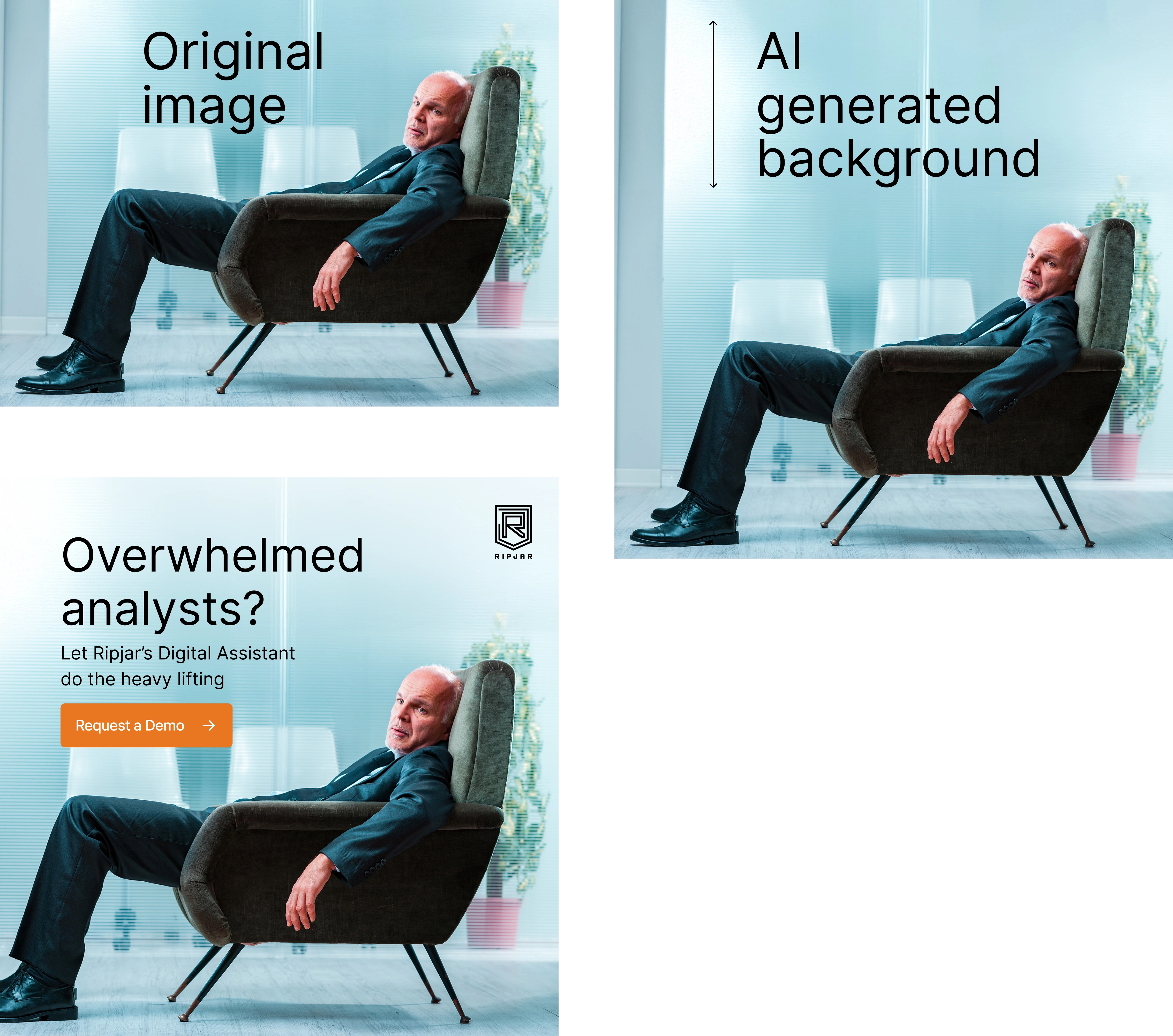
With the support of my management, I’ve integrated Gen AI into my graphic design process, using it to enhance the visual hierarchy of stock photos, as well as remove and add elements. In the example, I used Adobe Photoshop to extend backgrounds, creating additional space for content placement and ensuring a more balanced, visually effective composition.

Art direction - Iconography

These icons describe Ripjar’s features and services. They're simple in style and easy to grasp. They are used in their software, presentations, website, and marketing and sales collateral, whenever they want the audience to get a quick understanding of the product and the services they offer.

Results

Ripjar's has seen positive results from the rebranding, including the following benefits:

More Engagement
User engagement increased significantly, with longer average session durations on the website and a rise in social media interactions, enhancing Ripjar’s visibility within the cybersecurity industry.

MQL leads increased
High-quality content attracted users to inquire about Ripjar’s products and services. A memorable tone of voice combined with engaging messaging played a key role in expanding audience reach and drawing in new customers.
Better reviews
The rebrand reflected a strong sense of empathy, demonstrating Ripjar’s understanding of customer needs and resulting in more positive feedback from satisfied clients.

Enhanced brand recognition
Ripjar gained greater recognition in the financial compliance market, with its distinctive rebranding visuals and color palette making the brand easily identifiable at industry events. This strong visual presence set Ripjar apart from competitors, prompting event attendees to comment on the brand’s recognizability and express interest in its products and services.

See more projects

Want to work together?